
Apps from the 2015 Open Data lecture at the University of Bern

As part of the Open Data lecture 2015 of the Research Centre for Digital Sustainability at the University of Bern, 20 student teams developed their own open data applications. For most of the students, this course was the first time they had learned to programme. The interactive apps are mainly based on the open source JavaScript library D3.js and visualise data from various authorities, companies and other data sources.
Below is the ranked list of the apps as they were rated by an independent jury of 22 people during the final presentation (PDF on Slideshare and podcast). Switch has also published all video recordings of the lecture incl. slide presentations as well as the presentations from the programming exercise. Highlights of the lecture content were recently presented at the Bern architects’ meeting. Further information on the apps and the lecture is available from Matthias Stürmer.
1. Pollutant emissions in Switzerland
Pollutant emissions in Switzerland
Martin Vogel and Janik Endtner
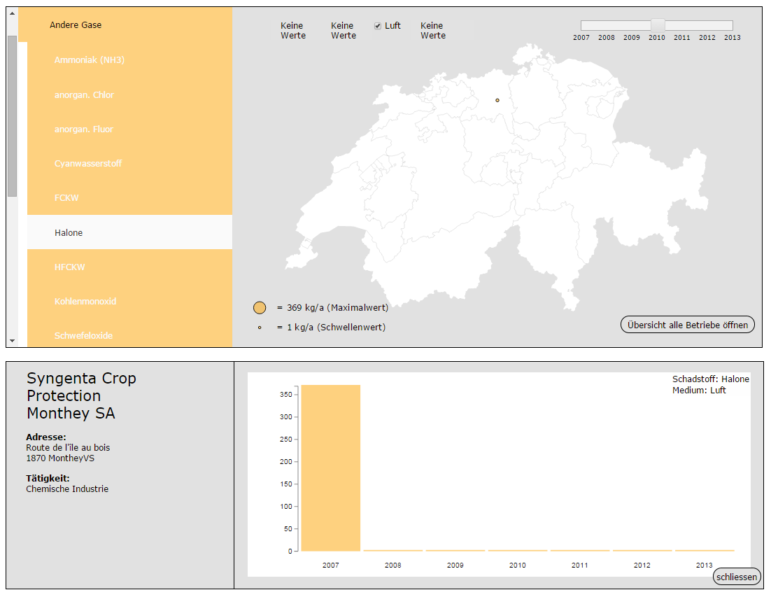
The visualised data are the latest available data from the FOEN. The application contains 86 different pollutants. In the respective years, these pollutants were released into the soil, water, air or wastewater by companies operating in Switzerland. Above a certain threshold, pollutant emissions must be reported to the Federal Office for the Environment. These reported figures have been visualised in this application.
2. Foreign population
Foreign population
Laurent Kaufmann and Lukas Heppler
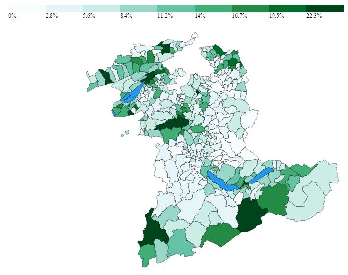
Immigration is an important social and political issue. With the aim of showing the proportion of foreign nationals and its composition in the Canton of Bern, open population data on the municipalities of the Canton of Bern was visualised. Clicking on a continent or a nationality changes the colouring of the map, which then shows the percentage share of the selected nation or continent in the permanent resident population.
3. Crime in Switzerland
Crime in Switzerland
Jenny Tran
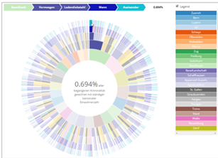
The datasets on offences committed against the Swiss Criminal Code in 2014 and over the last five years were visualised using a treemap and a pie chart. The visualisation allows the reader to make comparisons between different groups or within a group in a clear way. Without having to read the figures, the reader can pick out the orders of magnitude. The absolute figures are shown as a treemap and the per capita values as a pie chart.
4. Salary comparison by gender and education
Salary comparison by gender and education
Manuel Bühler
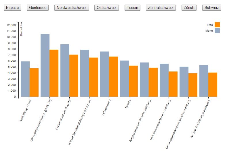
To get a basic impression of the salary differences between women and men, they are compared by education. By default, the values are shown for Switzerland as a whole. However, they can also be viewed individually for each of the major regions. Clicking the buttons adjusts the bars to the salary data of the corresponding major region. If you let the mouse rest on a bar, the corresponding gross salary is displayed in figures.
5. ImmoSearcher
ImmoSearcher
Gabriel Abu-Tayeh
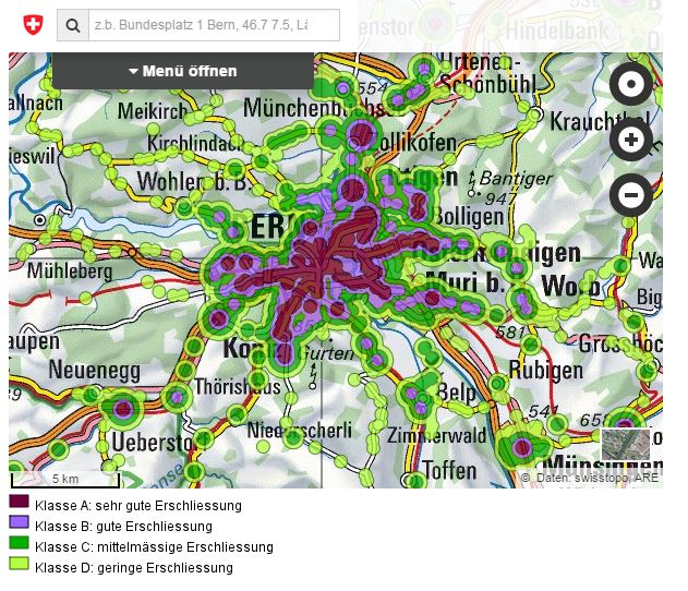
When looking for a property, potential tenants or buyers have to go to great lengths to gather data about the surroundings. Nor is it easy to compare a property with reference properties. ImmoSearcher combines objective geodata (for now on accessibility and noise) and references the data against a comparison property.
6. Swiss Public Transportation Visualization
Swiss Public Transportation Visualization
Samuel Hächler and Tizian Dähler
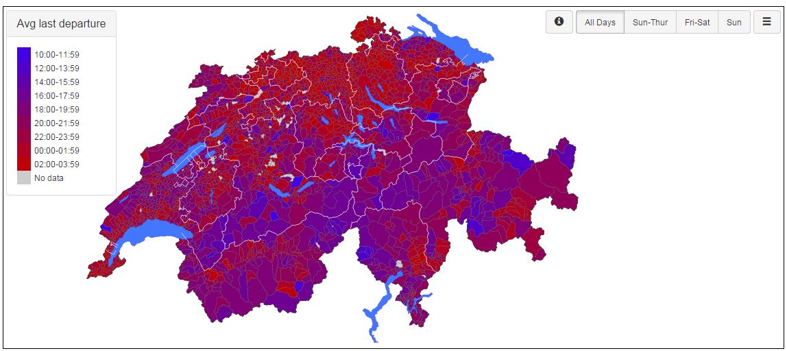
The app visualises timetable data of Swiss public transport companies at municipal level. Users can select various filters and display data on the average last departure, the number of departures or departures per person per municipality.
7. Reconciling work and family in Swiss cantons
Reconciling work and family in Swiss cantons
Aliu Opal and Nicoletta Lumaldo
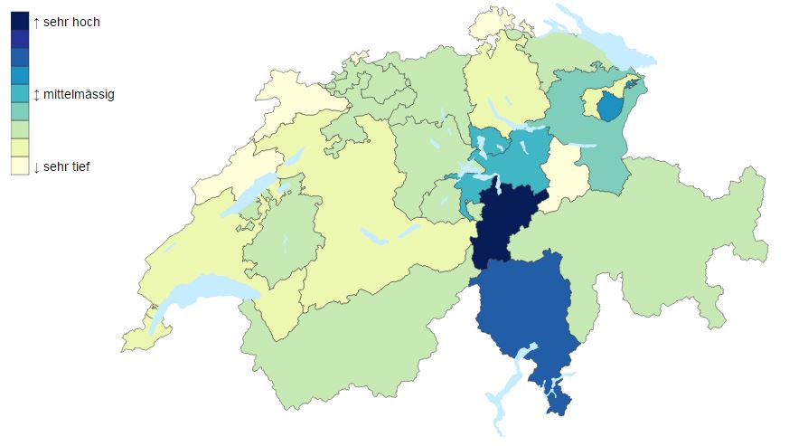
Switzerland is committed to gender equality. But how are the federal measures carried out by the cantons in implementing these policies? This app provides an overview of the factors relevant to reconciling family and work in Switzerland.
8. Vocational qualifications in Switzerland
Vocational qualifications in Switzerland
Dominique Rahm and Fabian Reding
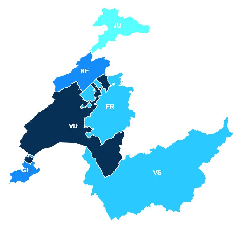
This app visualises data on the vocational qualifications of women and men in the Swiss cantons, broken down by occupational group, type of training and year of graduation. We took the data from the Federal Statistical Office and processed it.
9. The new Swiss 2013
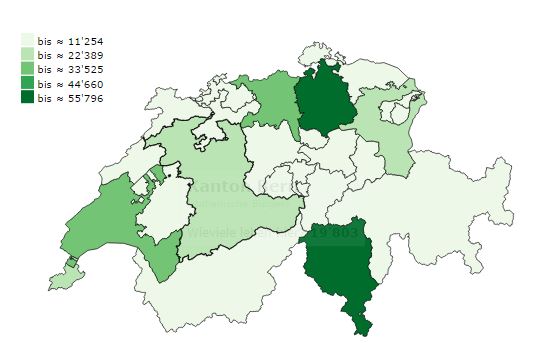
The new Swiss 2013
Michael Palma Mendes
This web app visualises naturalisation data for the six largest groups of foreign nationals living in Switzerland (as at 31.12.13). The most recent available year (2013) is analysed. The aim is to show which nationalities are naturalised where and how often, and whether their share of the naturalisation pool corresponds to their share of the foreign population.
10. Implications of lifting the EUR/CHF minimum exchange rate
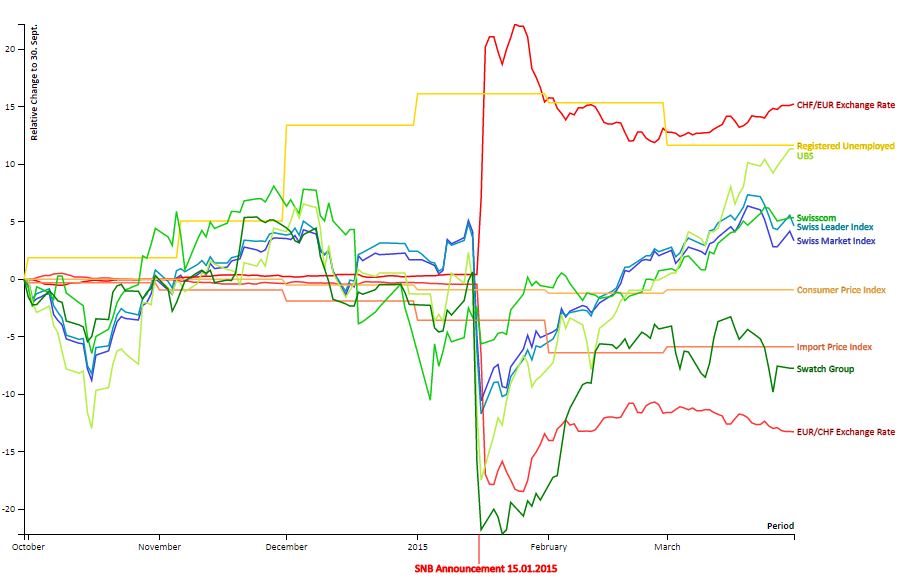
Implications of lifting the EUR/CHF minimum exchange rate
Alex Kräuchi and Johanna Croton
The application provides an overview of the implications for various areas of the Swiss economy of lifting the EUR/CHF minimum exchange rate, as announced by the Swiss National Bank on 15 January 2015.
11. The SNSF’s P3 research database
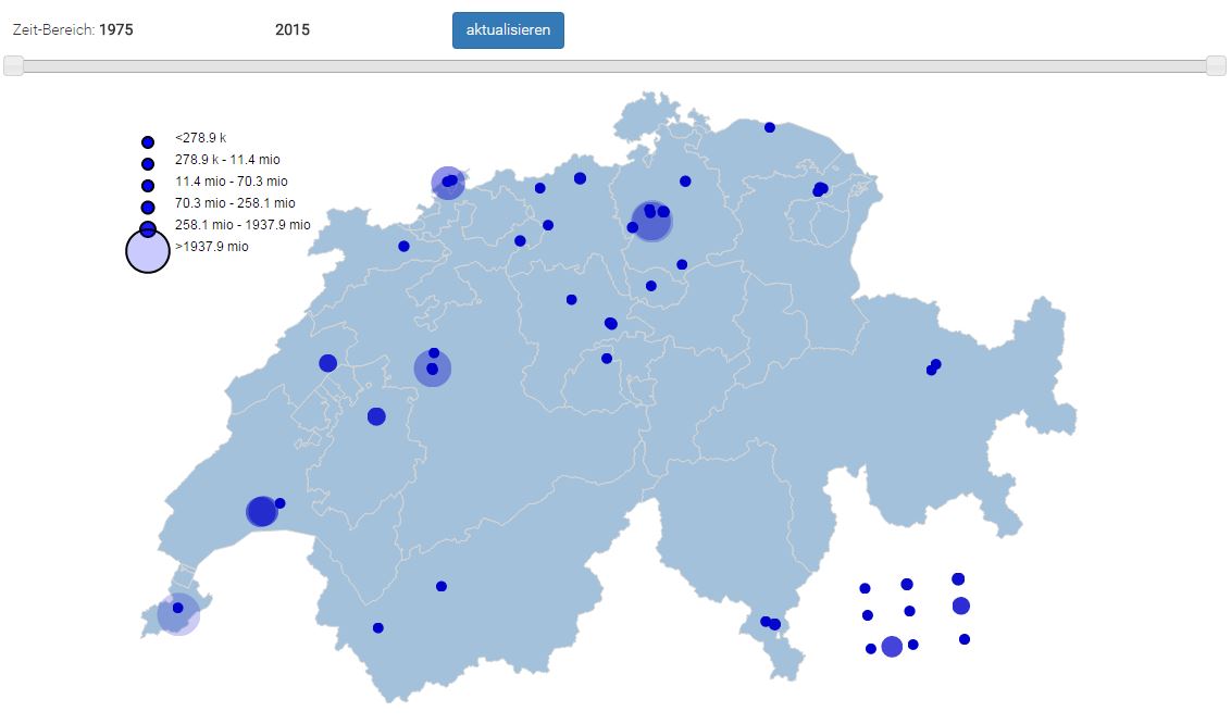
P3 – the SNSF’s research database
Matthias Bachtler
The application visualises the P3 research database of the Swiss National Science Foundation (SNSF). P3 contains all research projects approved by the SNSF since 1975 and grants awarded under other funding schemes.
12. Pollutant emissions of Switzerland
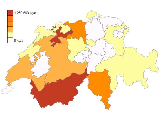
Pollutant emissions of Switzerland
Kathrin Ismair and Noel Sager
This application shows pollutant emissions in Switzerland, based on data from the Federal Office for the Environment’s SwissPRTR pollutant register. A first view shows the pollutant emissions from facilities by canton. A second visualisation shows how much of the emissions is attributed to facilities and how much to diffuse sources.
13. Visualisation of upper secondary school graduation data of the Canton of Bern
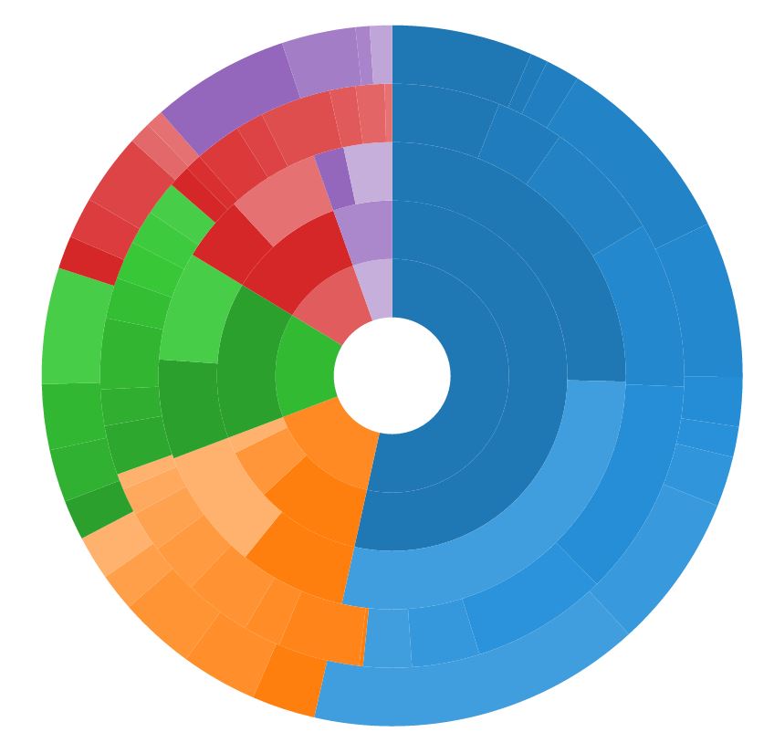
Visualisation of upper secondary school graduation data of the Canton of Bern
Theodor Truffer and Thomas Steinmann
This visualisation shows the graduation data of all baccalaureate schools and vocational baccalaureate schools in the Canton of Bern. The data was collected by the Education Department of the Canton of Bern.
14. Interaction: visualisation of the 2012 aid projects
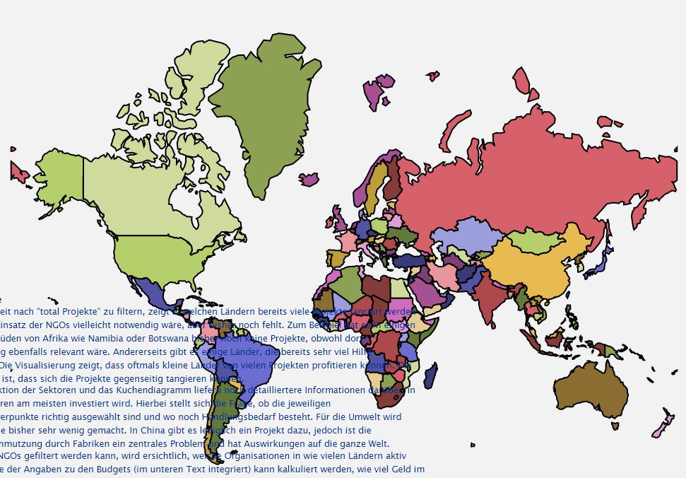
Interaction: visualisation of the 2012 aid projects
Stephanie Joss and Sarah Klingler
InterAction is an alliance of development organisations, relief agencies and mission societies. The visualisation of Interaction’s data shows how donations are used for aid projects, with all data displayed per country and per NGO on a world map.
15. Age structure of the Canton of Bern
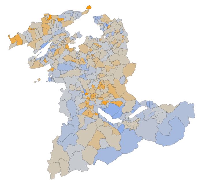
Age structure of the Canton of Bern
Tobias Bärtschi and Lea Summ
This visualisation of the population data of the Canton of Bern shows how the age composition of the population has changed. It also shows how the population of the Canton of Bern grew between 1981 and 2013 and how the ratio of young and old people in the total population has changed.
16. OPENED
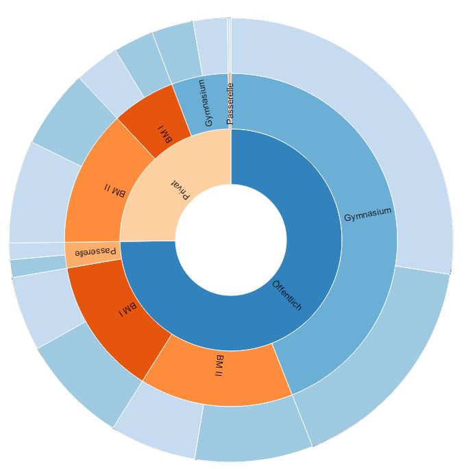
OPENED
Fabian Plüss and Manuela Krebs
Zoomable sunburst: upper secondary qualifications by provider, type and gender. The data source of the visualisation is the Canton of Bern’s statistics on educational qualifications (SBA), and it is part of our website www.opened.ch.
17. InterAction visualisation
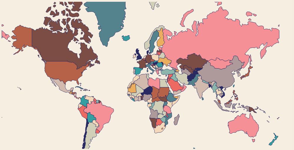
InterAction visualisation
Padideh Pezeshki and Irina Schubert
This application visualises data from InterAction, an alliance of development organisations, relief agencies and mission societies. Based on a world map, information on projects of 21 different NGOs is presented on a user-friendly platform.
18. Data protection in electronic legal transactions
Data protection in electronic legal transactions
Martin Lauber and Daniel Lam
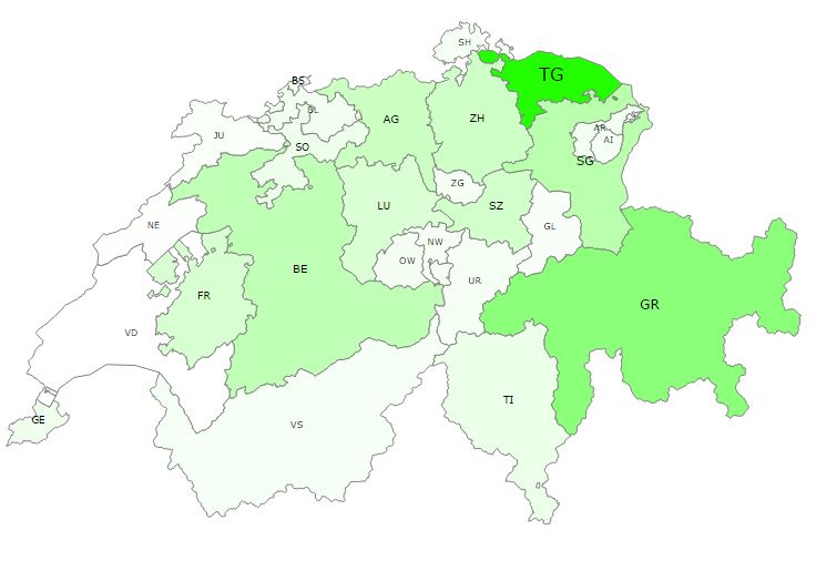
At federal level, most of our requests failed because of the protective measures. This is proven by the use of an encryption certificate. Five authorities state explicitly that they use one. However, only one of the five encrypts the metadata. In this application you can select any Swiss canton to find out how many authorities take part in electronic legal transactions. In addition, the pie chart on the right shows to what extent data protection is guaranteed for your electronic submissions.
19. The SNB’s monetary policy
The SNB’s monetary policy
Tobias Vogel and Mary Tzwaa-Krenzler
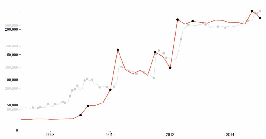
The idea of this app is that, with the SNB’s total assets as basic information, users can follow the SNB’s decisions and see what influence they have on the euro exchange rate, euro holdings and dollar holdings. Small hints in the box on the right help users to follow the course of the graph.
20. Population development in the Canton of Bern
Population development in the Canton of Bern
Yves Rieder and Franco Membrini
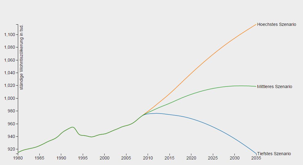
For the population development of the Canton of Bern after 2010, the Federal Statistical Office has drawn up three possible scenarios, which are shown here together with the actual development from 1980 to 2010. From a stochastic point of view, the three scenarios are considered equally probable. They comprise a high scenario forecasting massive population growth up to 2035, a medium scenario assuming a slight increase, and a low scenario which even foresees a decline in the permanent resident population to the 1980 level.